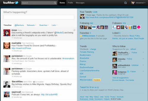
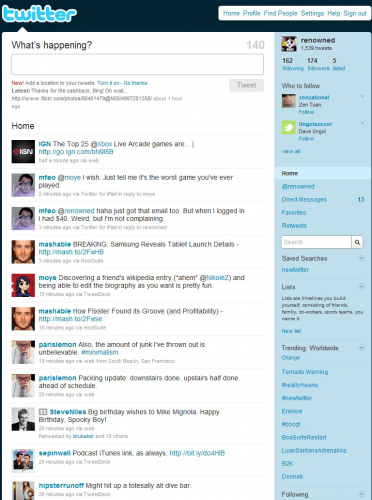
There it is, my friends, the new Twitter.com page. It’s quite a departure from the old Twitter.com page, wouldn’t you say?
Alright, so “quite a departure” might be a slight exaggeration based on the photos, but rest assured, it certainly feels that way. It may not look like the difference between Myspace and Facebook, but there’s some fairly significant changes to the site. I’ve spent the last day or so playing with it and I’ve gotta say, it’s a lot more enjoyable for me to use.
When Twitter flips the switch for your account, you’re immediately greeted with an explanation of the new UI:
Basically, it’s there to draw to your attention the biggest new feature of “New Twitter” – the embedded media display for supported picture/video services. At first, I thought the photos and videos would appear directly on Tweets in your stream. However, it turns out that you have to click the little film reel or photo icon on a particular Tweet to get the piece of content to slide out to the panel on the right. And before the first smartass points out that this is exactly what the information box above says, I say in my defense, “Whatever, who actually reads pop up windows anyway?”
A bunch of services are supported by this feature, including some of the most common, like YouTube, flickr, twitpic, etc. Support is not all-encompassing though, as my favorite Mac screengrabbing/sharing service, Skitch, didn’t seem embed the photo.
In addition to single pictures and videos, complete Flickr photosets are also supported:
It’s a neat feature, that shows thumbnails of all the photos in a particular Flickr set along with a slideshow and geotagging if enabled. I can’t say I’d use this very often, but it’s a neat thing to make people go “ooh” and “aah.”
Linking to a specific tweet will embed the content on that page without requiring the user to click:
I like the feature; it’s a better experience for me as I don’t have to leave the window to quickly check out a photo or look at a short video clip. However, I personally would have liked to see an option to show the content directly in the timeline. I really like how linking to a tweet shows any media content right on the page. The less clicking, the better, in my view.
Along with better media content display, the New Twitter also incorporates a much needed improvement for tracking conversations across tweets.
New Twitter will show which conversations can be tracked by a little word balloon icon in the timeline. Once you click it, you’ll see what the current tweet was replying to, kind of like the previous line of an instant message. From here, you can actually track the conversation further back by clicking an arrow on the top right of the right pane. This is something that I had to figure out on my own, as Twitter made no mention of this feature whatsoever. It’s a welcome one, as it makes Twitter more of a two-way communication tool, but we need to see a better explanation of how it works with a more pronounced interface.
In addition to providing better tools for following conversations, New Twitter also has a much needed new pop-up for when you are composing replies to tweets. Click “reply” on the timeline and a small window will overlay on the screen with a text box and the text of the tweet you are replying to below. It’s a “duh” feature, but I can’t tell you how many times I’ve clicked “reply” on a tweet in the old website timeline and completely forgotten what I was replying to.
Utilizing a collapsible two-pane window system is a great way to organize information with minimal page refreshes. One thing I used to hate about browsing tweets was that everytime I wanted to click on a profile to follow or learn more about someone, I was taken away from whatever I was looking at.
No longer.
Now, profiles smoothly slide over to the right and you can learn almost anything you want to about a particular person without leaving your spot in the timeline. Definitely a much needed improvement for the site.
Geolocation is an interesting feature to bring up as a bullet-point in presentations, but I’m still wary of sharing my location to the world on my tweets. It feels kind of creepy to be telling potentially millions of strangers of your exact location in the world, kind of like you’re inviting Skynet to murder you at its leisure.
Nevertheless, if you have no such qualms about geotagging your tweets, New Twitter will show tweets from people around a particular tagged tweet. It’s pretty cool to look at, but only as long as I’m not mentioned.
It’s here that I’ll disclose that I was never a heavy user of the Twitter website because it just didn’t provide the organizational and compositional features that I got from a good client. (I’m partial to Tweetdeck) The New Twitter is designed to put more content at your fingertips in an easy to get at manner. You can easily switch between your main timeline, mentions, several filters of retweets, searches, and lists seamlessly through the use of the navbar under the composition box. There’s even a blue dot under the “Home” button when you have unread new tweets (a nod to the Twitter for iPhone/iPad apps). However, your direct messages are curiously placed in a different location on the top nav and require a page refresh to display.
Despite the improvements, there’s a couple of must-have features that will keep me using TweetDeck if I have the choice. It’d be great if I could upload pictures/video/media directly onto the service like I can do with any client. It’s the next logical step for Twitter to get into the hosting game. If it doesn’t want to step on those toes, at least integrate those services into the site.
I also can’t figure out why Twitter still doesn’t have auto URL shortening when composing tweets on the site. I mean, they just rolled out their own t.co shortener right? Why do I have to go through the process of shortening a link in another window before bringing it into my tweet?
Oh, and there’s one more thing that I would be remiss if I didn’t mention. Power users of Google Reader or Gmail will be happy to know that New Twitter supports keyboard shortcuts similar to those services. “J” to jump to the next tweet? I’m there, sharebr0s!
New Twitter is a significant upgrade for a service that’s sorely needed not only a visual facelift, but also some feature additions and interface streamlining to make things more comfortable and easy to use. If I didn’t have access to a client (at work or away from my computers), I wouldn’t hesitate to use the New Twitter website to get my tweeting on.
Check out Twitter’s overview of the service here. It should be rolling out to everyone in the coming weeks.


Nice writeup.
You don’t need to click on the icons themselves to get the embedded media / conversation info. That’s just an indication of what the details pane will show when you click on the tweet as a whole.
I’m a big fan of the conversation stuff. I hope it encourages even more back-and-forth talk on Twitter.
Thanks, that was very useful